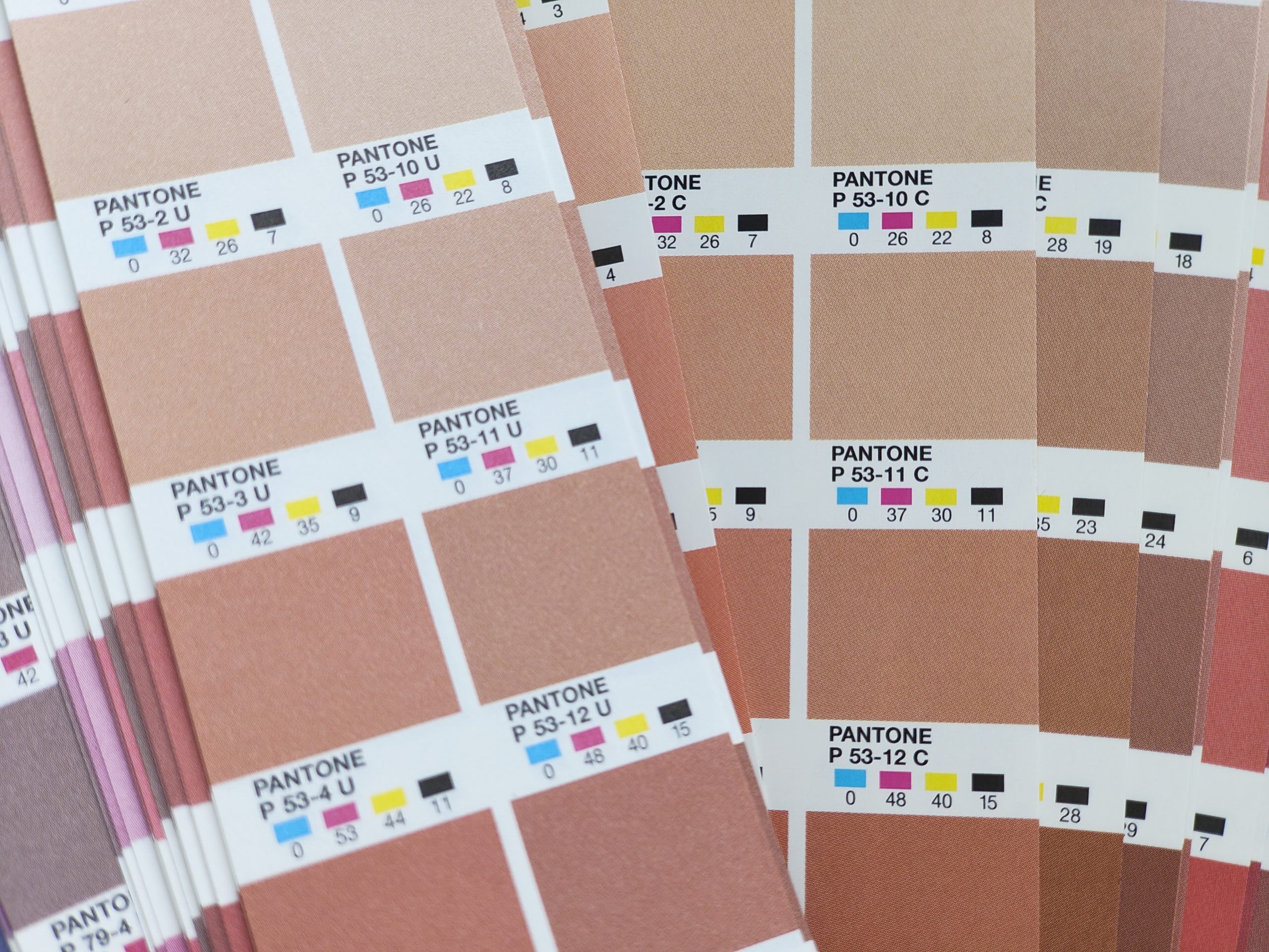
A Printer’s Plea for Understanding “U” vs. “C” (And Why Your Screen Lies)
Here at IMPAKS, we love passion. We love clients who have a vision, who care deeply about their brand, and who bring in their Pantone books to ensure everything is just right. That moment you point to a specific color swatch and say, “I want this exact green,” is a moment of beautiful, shared purpose.
But then, we ask the question that often deflates the room: “Are you printing on coated or uncoated stock?”
And often, we’re met with a blank stare. Or a finger pointed back at the swatch, with a hint of frustration: “No, just this color.”
Friends, clients, partners in print: we need to talk about the two alphabets that define our daily lives: “U” and “C.”
The Great Divide: What “C” and “U” Actually Mean
Let’s break it down simply:
-
Pantone C: The “C” stands for Coated. These swatches are printed on a shiny, coated paper. The ink sits on top of the smooth surface, resulting in a vibrant, sharp, and saturated color. Think glossy magazine covers.
-
Pantone U: The “U” stands for Uncoated. These swatches are printed on a matte, porous, uncoated paper. The ink soaks in and spreads slightly (a process called dot gain), resulting in a softer, duller, and often darker color. Think classic business card or letterhead paper.
The crucial point: They are not the same color. Pantone 185 C and Pantone 185 U are two different formulas of ink designed to look as similar as possible on their intended, and very different, papers.
The Screen Lie: Why Your Monitor is an Unreliable Friend
Before we even get to paper, there’s another, even bigger hurdle: your computer screen.
You’ve designed a brilliant, electric blue on your monitor. You’ve calibrated it with the Pantone Color Manager software. It looks perfect. But here’s the unvarnished truth: what you see on screen is almost guaranteed to be different from the printed result.
Here’s why:
-
RGB vs. CMYK (and Spot Colors): Your screen creates color using RGB (Red, Green, Blue)—light emitted directly into your eyes. It’s an additive process capable of very vibrant colors. Printing uses CMYK (Cyan, Magenta, Yellow, Black)—inks that absorb light. It’s a subtractive process with a more limited color range (or gamut). A glowing RGB blue simply cannot be replicated with CMYK ink. Pantone spot colors are special pre-mixed inks, but your screen is still just an approximation of them using RGB.
-
Monitor Calibration: Is your $500 monitor calibrated the same as our $5000 professional proofing monitor? Is your room’s lighting the same as ours? The answer is almost always no. Brightness, contrast, and color temperature settings vary wildly, making the same file look different on every screen.
So, when you point to your monitor and say, “I want it to look like this,” you’re asking us to match a variable, light-based illusion with physical ink on paper. It’s a battle hard to win.

The Conference Room Conundrum: A Scene We Know Too Well
Picture this: You’re in our meeting. You’ve chosen a stunning, vibrant royal blue from the Coated (C) guide for your new brochure. It pops! It’s energetic! It’s perfect!
But your brochure is being printed on a beautiful, textured, uncoated paper stock—a choice you made for its premium, organic feel.
We see the problem. We gently explain that the Coated swatch you’re looking at is a fantasy on uncoated paper. The color will print softer, less saturated. It will be the “U” version.
The response is often: “But I don’t want it to look like the U swatch. I want it to look like this one(pointing at the screen).”
This is our ultimate conundrum. You’re referencing two different unreliable sources: a screen showing an RGB approximation and a coated swatch for the wrong paper.
How We Can Solve This Together: A Three-Step Plan
-
Choose Your Paper First, Not Last. This is the single most important step. Decide on the feel and the paper stock before you fall in love with a color. Are you going for glossy and vibrant (Coated)? Or tactile and elegant (Uncoated)?
-
Trust the Physical Book, Not the Screen. Once you know your paper, close your laptop and open the correct section of your Pantone Guide (C or U). This physical swatch is the only true contract between us. Fall in love with a color there, not on your monitor.
-
Ask for a Physical Proof. This is the non-negotiable final step. A physical proof, printed on the actual paper with the actual inks, is the only way to see what you will truly get. It is the ultimate truth-teller.
The Bottom Line: Our Commitment to Your Vision
Please understand this: everything we’ve explained comes from a place of deep commitment. We are not trying to create barriers; we are trying to build a bridge between your vision and physical reality.
With the most clear guidance from you, there is nothing we cannot do to achieve the very best for our precious clients.
When you give us the right tools—the correct Pantone swatch for the chosen paper, and your trust in the physical proof process—we are freed to work our hardest for you. That is when the magic happens. That is when we can deliver a final product that doesn’t just meet expectations, but exceeds them, making your brand shine in the real world as brightly as it does in your mind.
Let’s move past the conference room confusion. Let’s choose the paper first, trust the physical swatch, and create something beautiful, predictable, and perfect—together.
Have a project in mind? Contact us today. Give us your clear vision, and let us show you what we can achieve as partners.


